Supporting Features
This topic will provide you with an overview of the features that will help you bridge the gap between necessary data entry and optimal user experience.
 Set Default Values
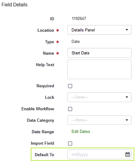
If you know that users enter similar values or possibly even the same one frequently, set an appropriate default value. You can use this option for the Date, Drop-down list, Number or Metric and Text or Reference # types in the Investment grid and the Details panel.
You set a default value in the Default to field of the Field Details dialog:
Add Help Text
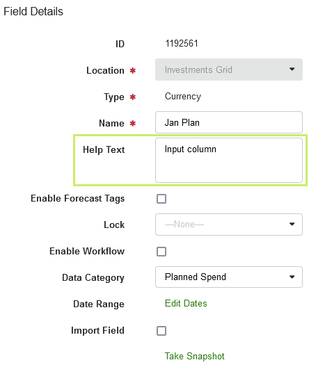
Help text appears when you hover over a specific field. This text can aid in providing context and guide marketers as they track their marketing spend. Help text can assist in defining specific fields and reduce confusion when first transitioning to Spend or introducing new fields to a marketing team.
You enter a help text in the Help Text field of the Field Details dialog:
Summarize Data Entry for Line Items in the Quick Entry Form
Fields and columns are displayed in different locations. To prevent users from having to open different locations and enter data when creating a line item, add the important data to the Quick Entry. The Quick Entry form is displayed when the user creates a line item.
Note
The Quick Entry form feature must be enabled in each investment plan before the field selection can occur. See Enabling Quick Entry Form for Investment Plans for more details.
Adding to the Quick Entry form is possible for all data entry types except Target (see Data Types for explanation on data entry types). The fields must be located on Details panel or Investments grid.
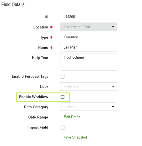
You add a field to the Quick Entry form by activating the Enable Workflow checkbox in the Field Details dialog.
Mark Important Data as Required
If the entry of data is indispensable, mark the entry as required. This is possible for data entry types (see Data Types for explanation on data entry types) except Currency on Investments grid. See the following table for a full overview.
|
Type |
Investments Grid |
PO Panel |
Actuals Panel |
Details Panel |
|---|---|---|---|---|
|
Currency |
|
|
|
not available for panel |
|
Currency (non-calculating) |
|
not available for panel |
not available for panel |
|
|
Date |
|
|
|
|
|
Drop-down list |
|
|
|
|
|
Multi-select list |
not available for grid |
not available for panel |
not available for panel |
|
|
Number or Metric |
not available for grid |
|
|
|
|
Text or Reference # |
|
|
|
|


You cannot mark an attribute as required on Transfer form, Roll-Up panel, and Grand Total panel as they are not intended for data entry.
If such a field is added to the Quick Entry form, a line item can only be created if the user has edited the field.
Best Practice
Try to balance the need for required fields with ease of use for your users. The more required fields you have, the more work is necessary to add new investments. We recommend only making fields required if absolutely necessary for reporting or integration.
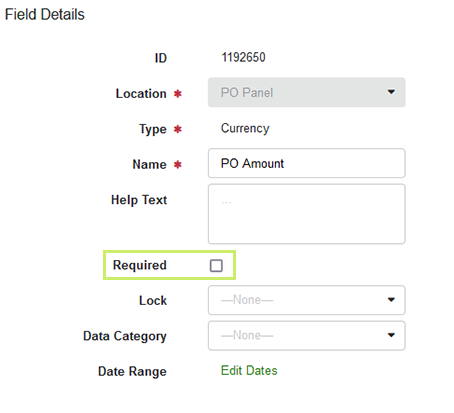
You make a field required by activating the Required checkbox in the Field Details dialog:
Alternatively, mark one or several fields or columns in the table at > Budgets > Master/Custom Settings > Columns and click the Required button above the table.
When a field entry is no longer required, you can reverse the need to have users make entries by selecting the checkbox once the desired field is selected.
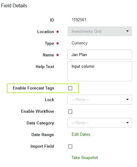
Enable Forecast Status Tags for Other Columns
The Forecast Status Tags feature allows you to better understand flexibility in marketing spends by reflecting the status of the latest expected costs. Usually, Forecast Status Tags are used in the monthly Forecast columns.
Forecast Status Tags can also be activated for other columns if the columns are Currency type columns (see Data Types) and if the columns are located in the Investment grid.
You turn on the Forecast Status Tags by activating the Enable Forecast Tags checkbox in the Field Details dialog:
Highlighting Columns in Investments Grid
Note
In order to use this feature, it must be enabled in your instance.
Depending on your requirements, creating columns may result in an overwhelming number of columns being displayed in the Investment grid. To help users maintain an overview even in extensive views, you can highlight the most important columns in color.
Note that this function is only possible for columns that are created in the Investment grid. Also, the coloring of the column is displayed in all views where the column is used.
Best Practice
Consider your users’ experience when creating colored columns. The effect of highlighting is weakened the more colored columns you use in a view. We recommend highlighting only the most important columns that are relevant to most users and in multiple views.
You set a color by clicking the Color field in the Field Details dialog.
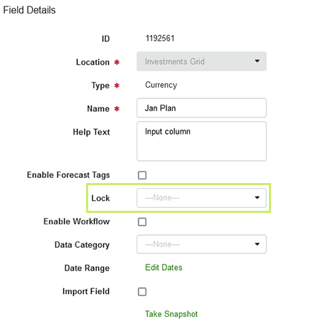
Lock Fields and Columns When Inputs Are Complete
If you want to make a column read only, use the Lock function. This means that the field or column can no longer be changed for any investment. An example is the locking of the plan columns, but you can lock all other data entry types as well if needed.
Be aware that not all columns and fields in all locations can be locked. If locking is not possible, the app will tell you.
Locking involves selecting a user role for which the lock should be active. You can select one of the following possibilities:
-
For Everyone: Nobody can adjust that locked Plan column, this includes Owners and Admins
-
For Administrator Level and below: Only users with Owner level permissions can adjust locked Plan columns
-
For Editor and below: Only users with Owner and Administrator level permissions can adjust locked Plan columns
-
For Editor - Data Entry and below: Only users with Owners, Administrator and Editor level permissions can adjust locked Plan columns
Selecting None in the dropdown equals unlocking the column.
These names can change according to the different roles configured for your organization
Note
Cross-check whether the Required or Quick Entry feature are enabled for the field/column you want to lock. If these functions are enabled, we recommend disabling them both when locking is activated.
You lock a column in the Lock dropdown of the Field Details dialog:
When locking is no longer required for a column, you can reverse the locking by selecting the None entry in the Lock dropdown.